Dr. Data Sciences’ guide to AI and Machine Learning Part 2
July 18, 2023

Core concepts of binary classification and why they matter.
In the previous blog, I discussed the impact of Machine Learning (ML) in our current world. We ended with two questions:
- In this brave new world of AI and machine learning (ML), how do we operate?
- As individuals, groups, businesses, and governments, how do we navigate a landscape filled with ML?
We need to understand what we’re working with before we can plan how to move forward. This blog will dive into some of the machinery that makes AI and machine learning work.
Back to basics
In the last blog, I used the concept of the simple harmonic oscillator as an example of a concept that kept coming up again and again during my studies. Something from an introductory text that I didn’t really take note of ended up being a concept that I would use regularly.
Machine learning is the same. Despite the fancy terms and complicated algorithms, every tech relies on statistics, linear algebra, differential equations, and regression.
So, let’s start with the simple harmonic oscillator of data science: binary classification via k-nearest neighbours (KNN).
A binary classifier is a model that discriminates between two different choices.
Is a tumour cancerous or not?
Will a customer make a 3rd purchase?
Will a home be vacant in a year?
Is this movie one that Selina will enjoy?
Binary classification problems are a subset of more general classification where there can be many different possible groupings. For example, a patient presenting to a hospital with a collection of symptoms isn’t being just evaluated as healthy vs not but evaluated for a range of different possible conditions. Typically, binary problems are much easier to deal with and conceptualize. Plus, the lessons we learn from these simpler examples tend to generalize to more challenging problems quite well.
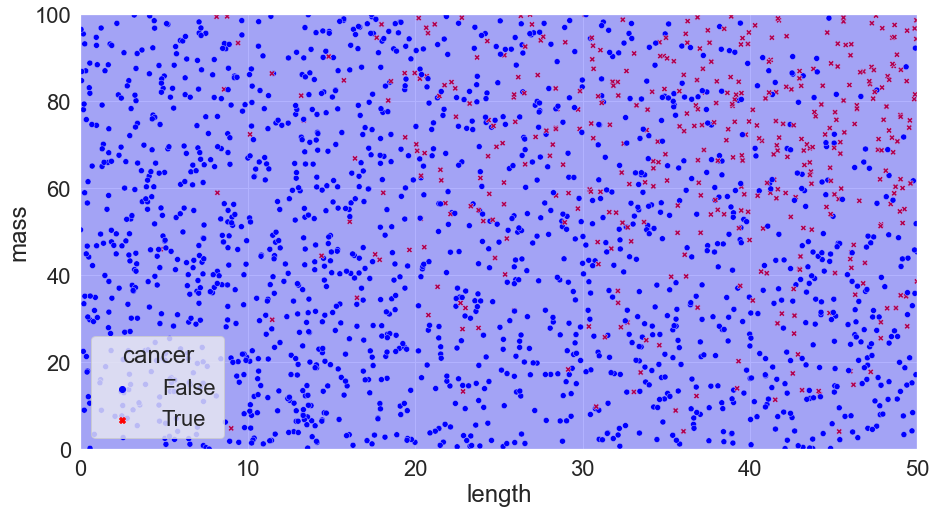
We’re going to be working with a (very contrived) example. Typically, data collection, cleaning, and preliminary analysis takes a huge amount of time (figuring out what variables to use is often the most difficult part!). We’re going to dodge around that so that we can focus on the classification itself. So, let’s say that we have done measurements on a collection of tumours. We’ve measured the length and the mass and have also denoted whether or not the tumour was cancerous.
| length | mass | cancer | |
| 0 | 1.709799 | 3.848387 | False |
| 1 | 40.356606 | 12.733613 | False |
| 2 | 8.405810 | 40.915604 | False |
| 3 | 34.322882 | 96.300517 | False |
| 4 | 35.709456 | 36.340553 | False |
We can plot this, placing the length of the tumour on the horizontal axis and the mass on the vertical. Crosses denote cancerous cells and circles denote benign cells.

This shows us all our initial data we have to work with. Even now, we can begin to start to pull insights (and note problems that might be present — does it really make sense for length to be short and mass to be high? What could be possible explanations?) from our data: clearly, according to what we have here, tumours with larger size and mass are more likely to be cancerous than smaller ones. Now, say that we get measurements from a new patient, indicated by a black square.
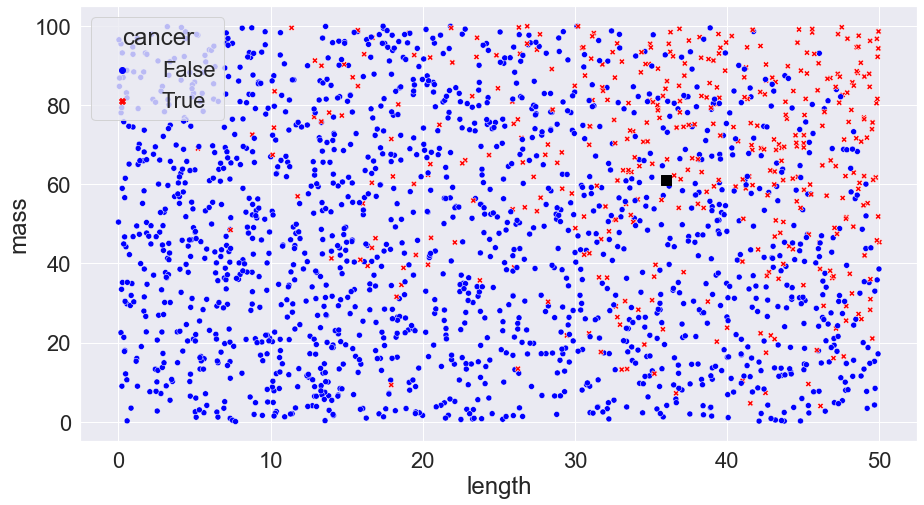
If the tumour is cancerous, the patient will have to undergo surgery which has plenty of risks; if not, the tumour can simply be observed for any future changes. Our task in making such a decision is one of probability: based on what we know about the tumour, what is the probability that it is cancerous? 5%? 15%? 95%? In the real world, we would have to balance the risks of surgery vs the probability of cancer but for simplicity we’re just going to go with a basic rule: if the probability that the tumour is cancerous is 50% or more than we’ll do surgery; otherwise, we’ll do follow up observations.
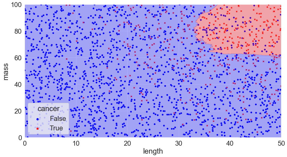
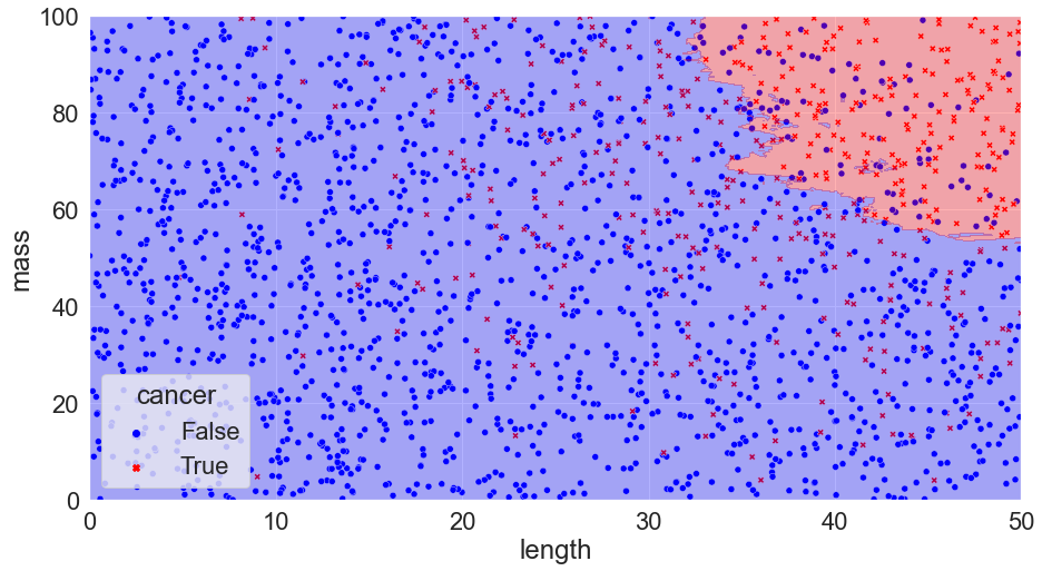
The difficulty comes with figuring out what the probability of cancer for each new case is. If we knew the underlying probability distribution, we could create the best model possible by simply drawing lines on our plot dividing the regions where the probability is greater than 50% and less than 50% (the boundaries lines are referred to as the Bayes decision boundary and a classification algorithm that makes predictions according to this boundary is called a Bayes’ Classifier):

Accuracy = 87%
However, we virtually never actually know this. Life doesn’t usually give us nice probability distributions: it gives us nasty, messy data that we need to try and draw inferences from. Essentially, we have to use the data to make guesses about where the boundary lines need to go. We’ll never do as well as the Bayes decision boundary, but we want to choose methods that get us as close as possible. The methods that we primarily use are machine learning (ML) models.
Here, we’re going to use the simplest model of them all: k-nearest neighbours.
What K-nearest neighbours does is look at every point on our plot and calculate how many of the k closest data points (where k is some number like 1, 2, 3, etc) are cancerous and how many are benign. If there are more benign neighbours in the k closest points, the point is considered benign; if there are more cancerous, the point is considered cancerous.
Calculating this by hand would be absolutely awful — fortunately we have computers!
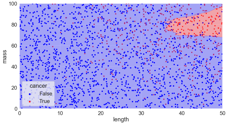
Taking our example and trying three different cases, k = 1, 300, and 500, we get:

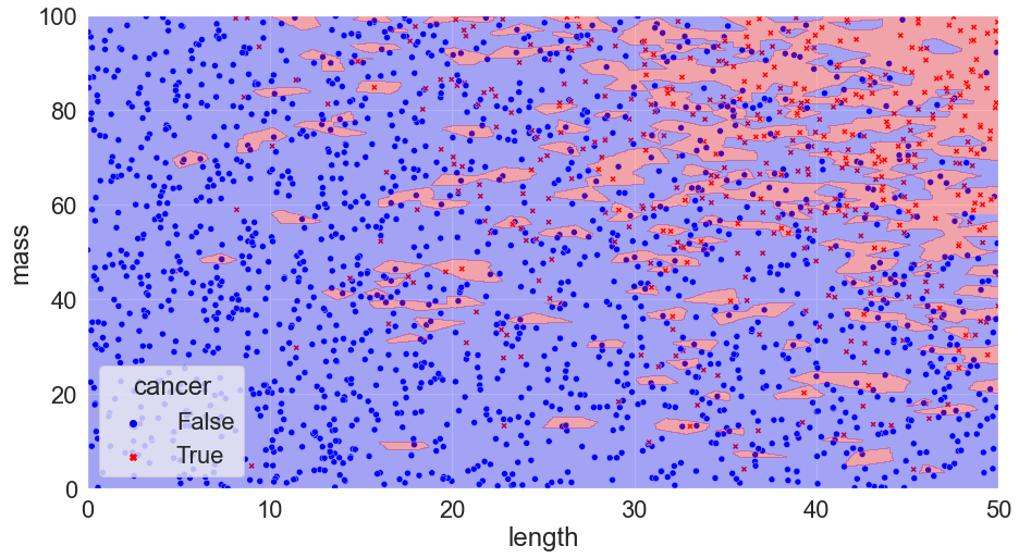
K = 1, Accuracy = 100%
K = 300, Accuracy = 82%
K = 500, Accuracy = 79%
You can see that we’ve calculated the error in each scenario just by taking the number of correct calls and dividing them by the total number of calls. We might notice something interesting with the scenario where k = 1: there are no mistakes! Clearly, we’ve discovered the perfect solution. We can pack things up and go home.

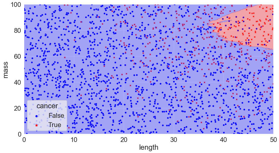
Alas, if something looks too good to be true it almost certainly is. We’ve run into a famous issue known as overfitting. Although our model perfectly matches our data, it has become too customized and if we apply the model to a new set of data we run into trouble:
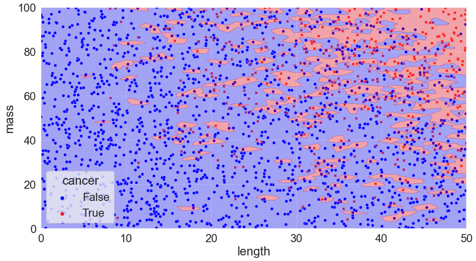
Accuracy = 75%
We can see that our predictions miss the mark (and things can get much worse than 75% accuracy!).
How can we avoid issues like this? We do this by breaking things into a training set and a test set* (extremely picky readers may demand a cross-validation set – because this is an intro to machine learning blog, we’re ignoring this for now).
The training set is used to train the model: we use it to calculate all the decision boundaries.
Once this is done, we check our accuracy on the test set: if the model is a solid predictor, then (normally) it will perform well on the test set.
Redoing the KNN (k-nearest neighbour) model, training only on the training set and calculating the accuracy on the test set we get updated predictions for our k = 1, 300, & 500 models.
K = 1, Accuracy = 77.5%
K = 300, Accuracy = 82%
K = 500, Accuracy = 79%
We can see that the k = 1 model doesn’t perform as well in this case: it’s overfit! On the flip side, k = 500 doesn’t work that well either: this model is too rigid and is underfit* (In ML, being underfit is called being biased. Overfit is when the model chases the training data too closely, and biased is when it is not responsive enough to differences in the training data. These two opposite issues create one of the most important tradeoffs in ML!) – it simply predicts that every tumour is benign!
In order to find the best possible model, we can write code to test all values of k from 1 to 500. After doing so, we can take the best performing model and use that for our predictions. Ultimately, we find that a wide range of k’s function relatively well — anything from about 40-120 in this case.
K = 60, Accuracy = 85%
We can see that a K value of 60 performs quite well compared to the ideal Bayes classifier (remember, this is the best we can theoretically do)! It doesn’t quite get the shape right, but it’s a solid start.
At this point, we need to take a step back and evaluate our model:
- Could we add in additional measurements that would improve things?
- Are there relationships between variables that we should consider?
- Do we have redundant variables in our model?
- In our example both length and mass of a tumour were used: are these things related? What does this mean for our results?
This process of critical analysis is often far more important than the model itself; insights are very rarely completely obvious.
Although this was an incredibly simple example with a fake data set, the lessons we draw out of it mirror that of the simple harmonic oscillator: both are toy problems, but, nevertheless, both contain many of the core themes, thought processes, and pitfalls that we see in more complicated tasks. With the simple harmonic oscillator, the challenge is how to determine the equations of motion at higher & higher degrees of complexity; in classification problems it’s decision boundaries for ever more complicated scenarios. A bit more explicitly, when we look to do customer churn analysis, voter identification, cell classification or whatever other project that gets thrown our way, all we’re ultimately doing is playing around with models of probability — just like in our toy example of KNN (k-nearest neighbour) – and, as such, can run into all the same issues: overfitting, bias, messy data, and edge cases. No matter how complicated the model & the math behind it gets, we never escape the fundamentals; they just appear in different forms.
Building models and making predictions is hard. It requires a combination of industry-specific knowledge, mathematical competence, and technical proficiency. Learn as much as you can about the problem (and the client!), start simple, add complexity as needed, continuously re-evaluate, and always, always try to consider externalities. These ideals form the core of my approach to working with data at DS.
Learn more about AI and Machine Learning from Paul in Part 1 of Dr. Data Sciences’ Guide to AI and Machine Learning.
About the authors
I’m a theoretical physicist who converted to the world of data science after finishing my PhD, where I studied particle phenomenology. I’m part of DS’s data team and I’m primarily focused on building mathematical models and understanding hidden trends. Outside of work, I’m a national-level cheerleader – I love both tumbling and stunting — and am grinding in an attempt to make Team Canada!